so you've got a fount of Monotype 587 Georgian in 12D and an empty job case, but don't know where to put all the letters. well, neither do i, though i'm willing to give it a try and bear the brunt of rearranging the case if i find it to be unintuitive.
historical options
handsetting techniques, 1968
these two layouts are from მ. ვეფხვაძე's (M. Vepkhvadze) 1968 primer on typesetting, ხელით ასოთწეობის ტექნოლოგია. it describes three layouts, which are detailed below. there is some uniqueness in the terminology used in Georgian vis-a-vis spacing material. you can find a translation with notes on the subject of spacing in the appendix.
in the images below, -- represents an em-dash, which does not show up distinctly in the ascii diagrams. note that for the first two cases, it is sort of haphazardly put into a slot on the left-side, before moving to be with other punctuation on the right after the 1935 standardization.
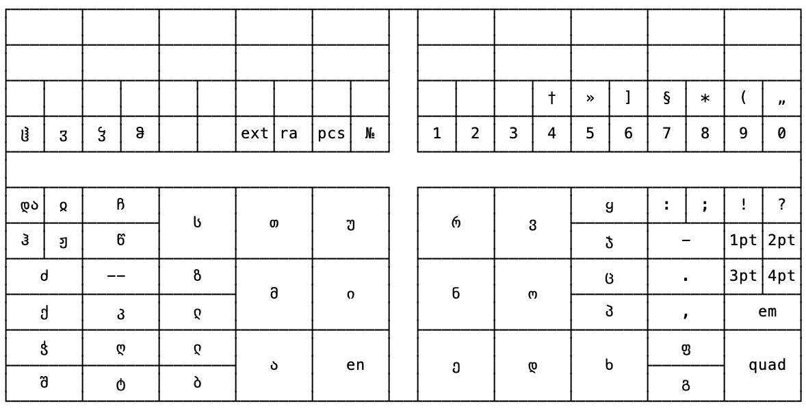
old georgian case, pre-1935
this was based on the historical Russian case, with most of the larger compartments sharing the same phonetic value (მ/м, etc.). the case itself was adopted wholecloth, which left a lot of leftover space due to the lack of capitals in a Georgian font.
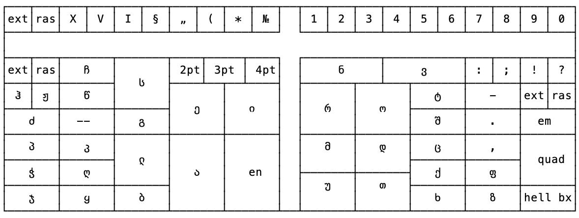
Goguadze, 1935-1940
based on analysis of letter distribution, Goguadze's case design is smaller than the prior Russian case and concentrates the most common letters in the center based on commonality. you can see the full breakdown of percentages in the appendix below. one notable feature is the box marked ჰარტი (type-metal), which signifies a hell box built into the case.
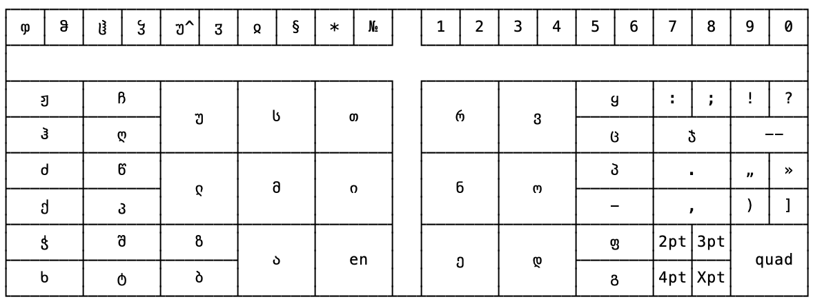
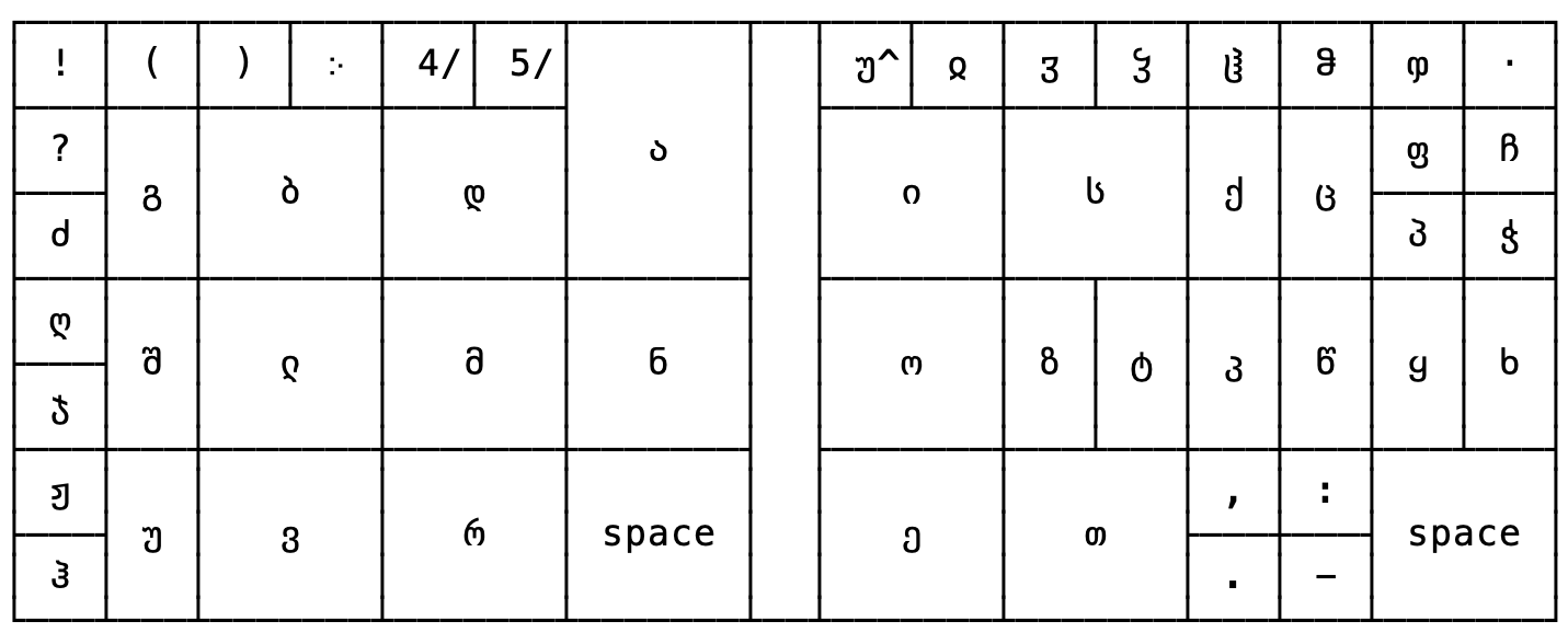
standard Soviet, 1940 onwards
this new standard, following the 1934 standardization of the Russian typecase layout and the subsequent standardization of the sizing of said typecase in 1938, was proposed by A. Todua of the Georgian Typeface Committee. major differences, besides the sizing, was removal of empty / miscellaneous boxes and the inclusion of archaic letters and a 10pt spacing box (represented by Xpt in the diagram). as with my own case design below, the უ^ is an artifact of Monodraw, it means უ̂.
stephen austin, 1950s
these two cases were taken from the unaccessioned Stephen Austin Georgian cases at the British Museum. they're estimated to have been acquired some time in the 90s. definitely weird cases, many of the sorts were very sparse, which leads me to believe there were likely standing forms at some point that got scrapped. in the 12pt (actually 10D/12) case there are some blank entries, indicating they were empty sections in the case (and also that S&A set something in the 12pt, probably running text, based on the punctuation used, but this has not yet been identified). additionally, where you see non-solid dividers, that means the sections were artificially divided. some observations:
- the newspaper batting in the case has a date of March 22, 1949, which is in line with the 1950 publication date of the GE-EN Dictionary Stephen Austin printed on behalf of the OUP, which is the earliest publication i am aware of using this face (and indeed, the only one, at present).
- there is no ქ in the 14pt, but based on the standard California job case and the location in the 12pt, it was probably above წ.
- no 14pt figs.
- !, ?, ; for 12pt were clearly a different face, not yet identified.
- the figures for 12pt were still in what i presume was the form from the caster – just lines of 20 numbers.
- the distribution of characters more or less follows a transliteration scheme for Georgian to English, but clearly goes off the rails once you start dealing with ejective consonants and historical letters.
- there is no raised interpunct for Monotype 587 in the case (and i did not see it mixed in with the periods). perhaps this was not cast.
14pt
12pt
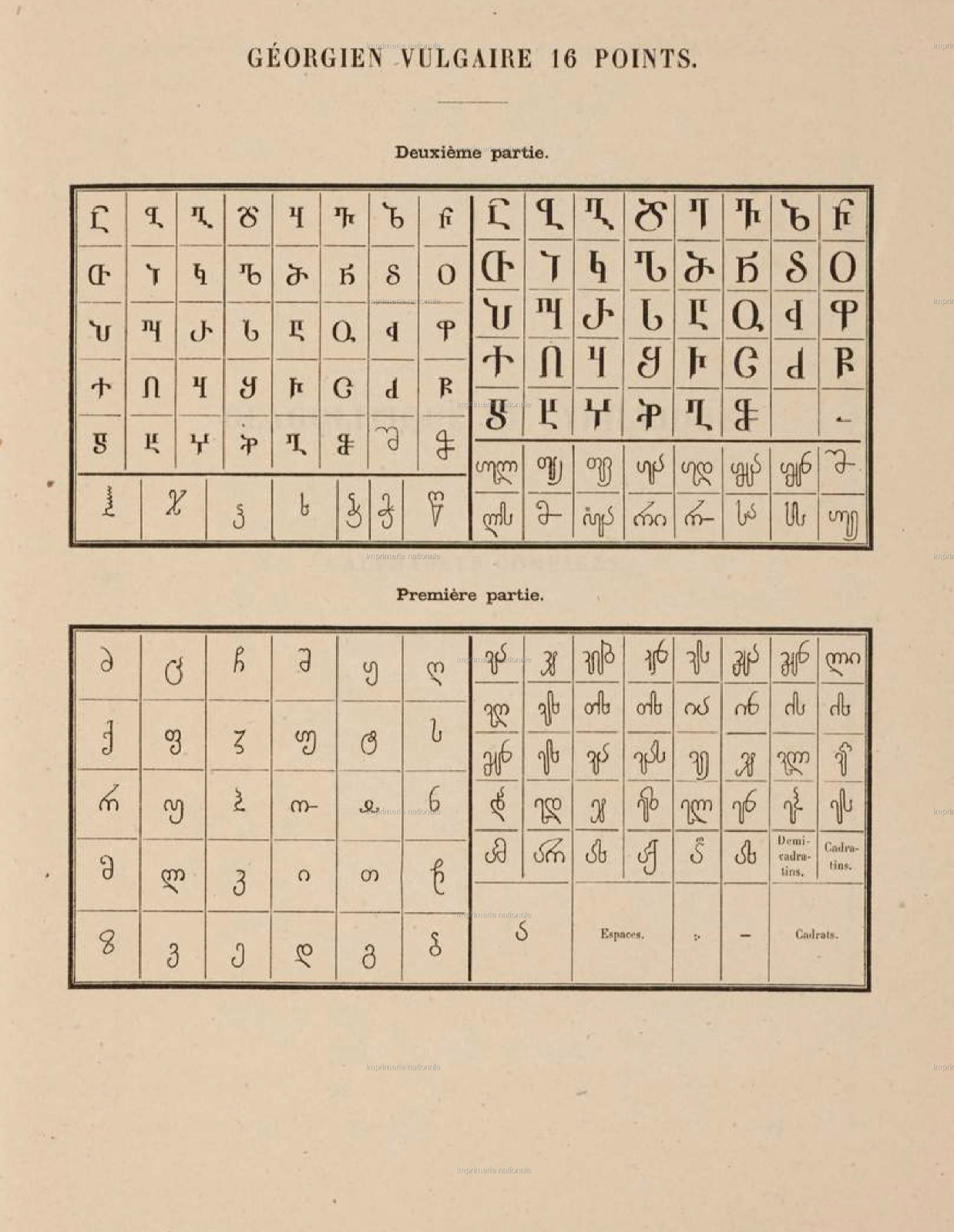
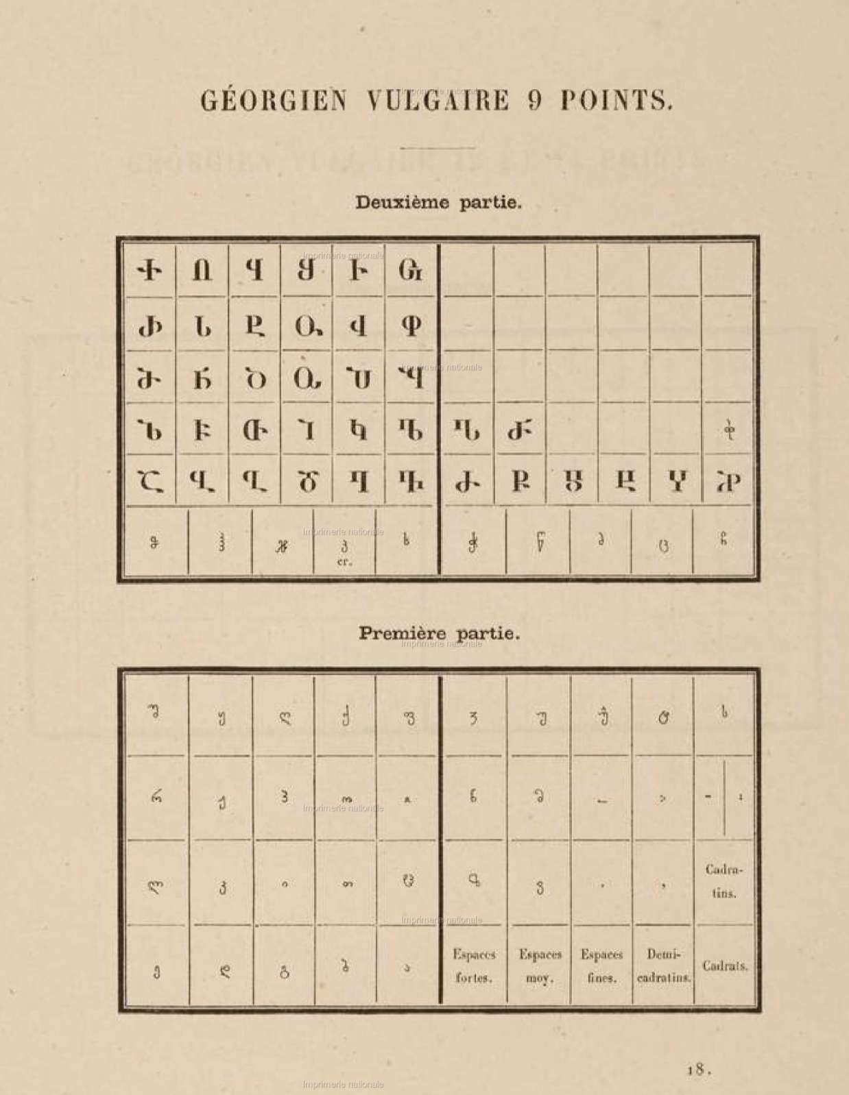
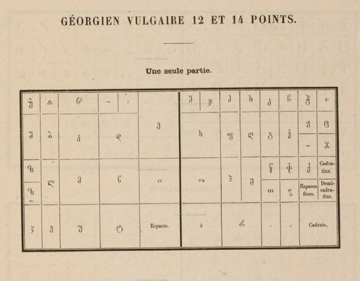
imprimerie nationale, 1885
the following two layouts are from the Imprimerie Nationale's 1885 book of case layouts, Modèles de casses des caractères de l'Imprimerie nationale. as you can see comparing with the above, it is unlikely these were ever used by native Georgian printers.
propaganda fide
16pt
this layout follows alphabetically from ა in the bottom right, upwards, including ligatures and alternative forms.
delafond
you'll note two instances where the character is marked with er.. these appear to be simply duplicates, thus er indicated "erreur", but i'm not sure if that is an error in the printing or an error in filling out the case.
9pt
follows alphabetically, starting with ა in the bottom right of the left partition, continuing upwards, extending into the right partition.
12-14pt
a 16pt cut by Delafond also exists, however, is not shown. this case layout follows letter sounds, but not frequency. depending on how the text was given to the compositors, this may have been the most expedient method as it reduces the number of new hand movements they would need to make.
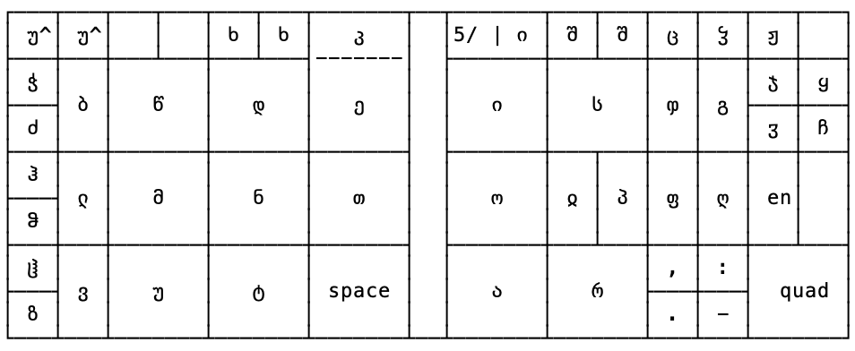
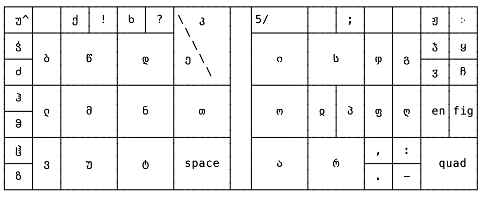
my design
i tried to approach this with two things in mind:
- frequency is worth trying to adhere to. this was derived from the (admittedly somewhat handwavy) proportions of sorts for the initial fount i got.
- some logical nature to where it has to break alphabetic ordering. i decided that given the number of ejective pairs in Georgian (ქ/კ, ფ/პ, etc.), those were worth keeping. you can see this on the right side: ejective consonant is on the bottom, non-ejective on top.
other things worth mentioning: like the two historical faces, this includes some historical characters, which i've placed in the smallest boxes for now. these may move to the uppercase side of the case if it turns out to be more expedient to have more modern letters available. the უ^ is an artifact of Monodraw, it is for უ̂.
appendix
maybe you want to make your own case layout? here is a Monodraw file and a text-only file that has a blank California job case that you can play with.
a small note on spacing terminology
from ხელით ასოთწეობის ტექნოლოგია, pg53-54. i've placed the georgian terminology in quotes since it does not corespond one to one with english usage.
პირველ ჯგუფს მიეკუთვნება შპაცები, გამყოფები და კვადრატები (ნახ. 33). შპაცი ძელაკის1 ფორმის ყველაზე წვრილი სახარვეზო მასალაა, იხმარება ასოებისა და სიტყვების ხარვეზებიათვის. შპაცებს ამზადებენ 6, 8, 10, 12, 16 და 20 კეგელით, რომელთა სიგანეა 1, 1 / 1/2, 2, 3, 4, 5, 6, 8, 10, 12 და 16 პუნქტი.2 გამყოფი ეწოდება ისეთ ძელაკს, რომლის ორი მხარე უდრის მოცემული შრიფტის კეგელს, ორი დანარჩენი მხარე — შრიფტის კეგელის ნახევარს, ორმაგი გამყოფის დამახასიათებელია ის, რომ მისი ოთხივე მხარე უთანასწორდება მოცემული შრიფტის კეგელს.
The first group consists of შპაცები (shpatsebi – "spaces"), გამყოფები (gamqopebi – "gaps") and კვადრატები (k'vadrat'ebi – "quads") (see 33). "Spaces" have the narrowest form of the spacing material and are used for separating letters and words. One uses "spaces" with 6, 8, 10, 12, 16 and 20pt faces, in widths of 1, 1 / 1/2, 2, 3, 4, 5, 6, 8, 10, 12 and 16 points.3 "Gaps" are those pieces which two sides are equal to the point size and the two remaining sides – half the typeface's point size. The characteristic of the ორმაგი გამყოფი (ormagi gamqopebi – "double gap") is that its four sides are equal to the point size of the given typeface.
კვადრატი უფრო დიდი ზომის სახარვეზო მასალაა, ამზადებენ 1, 2, 3, 4, 6, 8, 10, 12, 16-პუნქტიანი კეგელით, რომლის სიგანე 1/2, 3/4 და 1 კვადრატია. კვადრატებით ადვილად წარმოებს შედარებით დიდი სახარვეზო ადგილების შევსება.
"Quads" are a larger spacing material, one uses them in 1, 2, 3, 4, 6, 8, 10, 12, 16pt, for which there are widths of 1/2, 3/4, and 1 "quad".4 With "quads", one easily carries out filling up the remaining large space [of a line].
font schemes
i've yet to find actual published font schemes (e.g. from a typefoundry), so i present two approximations of one: from ხელით ასოთწეობის ტექნოლოგია, which is based on a literature survey, giving percentages and one from my own survey, when ordering a font of Monotype 587 (specfically reviewing the text of the first დაგდაგანი album, the text of ვანო და ნიკო, and the orthodox psalms).
numbers given are percents, the first number from ხელით ასოთწეობის ტექნოლოგია, the second from my calculations. mine include obsolete characters, in case i wanted to print the orthodox psalms in the archaic forms (and cause i wanted examples of every character in the typeface).
my numbers can be referenced off of 1100 ა sorts (or 1280 ა sorts for those from ხელით ასოთწეობის ტექნოლოგია) and include the obsolete characters. if you do not want to include them, then the literature numbers should be considered a 1231ა scheme.
note that the 1100ა scheme will result in what would have traditionally regarded as a half font. if you want to go full bore, double that number for great success.
- ა: 15.2 / 13.06
- ბ: 3.5 / 2.97
- გ: 2.2 / 1.78
- დ: 4.4 / 5.93
- ე: 9.1 / 7.12
- ვ: 4.1 / 4.75
- ზ: 0.7 / 1.19
- თ: 2.9 / 2.97
- ი: 11.3 / 8.90
- კ: 1.1 / 1.78
- ლ: 4.5 / 2.97
- მ: 5.5 / 4.75
- ნ: 3.7 / 4.75
- ო: 4.9 / 5.93
- პ: 0.5 / 0.59
- ჟ: 0.05 / 0.30
- რ: 5.9 / 4.75
- ს: 6.5 / 7.12
- ტ: 1.2 / 1.19
- უ: 2.6 / 1.78
- ფ: 0.6 / 0.59
- ქ: 0.9 / 1.19
- ღ: 0.7 / 0.59
- ყ: 0.7 / 1.19
- შ: 1.8 / 1.19
- ჩ: 0.5 / 0.59
- ც: 1.4 / 1.19
- ძ: 0.5 / 0.59
- წ: 0.9 / 1.19
- ჭ: 0.2 / 0.59
- ხ: 1.7 / 1.78
- ჯ: 0.2 / 0.59
- ჰ: 0.2 / 0.30
- ჱ: x / 0.30
- ჲ: x / 0.59
- ჳ: x / 0.59
- ჴ: x / 0.59
- უ̂: x / 1.19
- ჵ: x / 0.30
- ჶ: x / 0.30
as you may or may not be able to tell at a glance, they are reasonably close. the major differences are ი (2.40%), ა (2.14%), ე (1.98%), დ (1.53%), ლ (1.53%). at the size of a case, this is going to be a difference between approx. 150 and 200 sorts. there is one other small difference in the schemes that i thought was funny: i have more ყ due to one... somewhat vulgar... song in the დაგდაგანი repetoire. i leave it as an exercise to the viewers to figure out which one)))
wood type
using the literature percentages, then based off of 8ა, i came up with this woodtype scheme. generally, it takes the 8ა percentage and rounds up. in the case where the percentage results in 0 sorts, i opted for 2, based on normal english schemes. additionally, i made some bumps for a few (most notably ვ) based on the titles of დაგდაგანი songs.
- ა: 8
- ბ: 2
- გ: 2
- დ: 3
- ე: 4
- ვ: 6
- ზ: 2
- თ: 2
- ი: 6
- კ: 2
- ლ: 2
- მ: 3
- ნ: 3
- ო: 3
- პ: 2
- ჟ: 2
- რ: 3
- ს: 4
- ტ: 2
- უ: 2
- ფ: 2
- ქ: 2
- ღ: 2
- ყ: 2
- შ: 2
- ჩ: 2
- ც: 2
- ძ: 2
- წ: 2
- ჭ: 2
- ხ: 2
- ჯ: 2
- ჰ: 2
-
ძელაკი: ოთხკუთხი მცირე ზომის საგანი (საგანი: thing, object) – a small, four-sided thing ↩
-
note the difference between კეგელი and პუნქტი. Both come from German (Kegel & Punkt). A Kegel refers to the body size of a piece of type, whereas Punkt is a general word for point. These usages are also found in Georgian typesetting. ↩
-
The idea of a "space" being 16pts wide is quite large, but if "spaces" and "gaps" were used interchangeably, then a 16pt wide "space" would be the same as a "em" for a 16pt face. ↩
-
Similar to the unexpected widths of some "spaces", a 1-4pt "quad" does not mesh with our expectations of "quad" in English, but this likely refers to strip material, such as leading and slugs. ↩
last updated: 2026-06-06 10:51:52